|
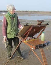
I've been asked about the image that forms the banner for the home page. It's a pastel of Wells-next-the-Sea in Norfolk, entitled 'Evening Light.' It was worked on a half imperial Canson paper, and the amber glow was achieved by using the colour of the paper.  Evening Light, Wells-next-the-Sea © Judith Key  Pastel papers come in a variety of tones and colours, and usually I choose a middle tone buff or warm grey, allowing both the darks and lights to stand out equally. But on this occasion I went for a slightly wilder colour. I was attracted by the light on the water, and spent some time observing the contrasting tones that surrounded and intensified its effect. Then I set about mentally stripping out the clutter and choosing which boats I was going to use, and how they sat in relation to each other. I was planning the underlying structure of the piece, which I found to be full of diagonals and triangular shapes - they were everywhere, among the boats, between the masts and rigging and in the interplay of light and dark water - it was endlessly fascinating, until I realised that the sun was threatening to desert me for the night, and it was time to put my observations into practice! I used a balance of painterly and linear marks with this subject - I hadn't planned it that way, but having set the composition, and started work, I found myself drawing in rapid linear strokes. On a another day with a different light and atmosphere, I would possibly have worked in a more painterly way. The colour palette was tonal and spare - 95% of Evening Light was worked with the colours you see here - from top to bottom, a couple of pinkish and purple greys, a deep blue for the hull of the foreground boat, the palest yellow ochre for both sky and the light on the water, a touch of mid-toned ochre, a reddish earth and a deep umber for the superstructure and main masts on the larger boats. Intermediate tones and colours were achieved by playing one colour over another, and this effect can be seen around the edges of the deep blue in this sample swatch. How much paper I leave blank depends on the subject and my interpretation of it - there is no hard and fast rule - a pastel can be anything from a simple pared down line drawing to a full blown painterly piece of work that covers every inch of the paper surface. In the case of 'Evening Light' you can see that a fair percentage of the paper was allowed to play its part in the composition. 'Evening Light' is available as a greetings card, which can be purchased at any of my painting demonstrations and talks - or just flag me down wherever you see me working out of doors, as I normally have a selection to hand. Just don't creep up behind me and take me by surprise when I'm trying to draw a straight horizon - otherwise I may well end up with an unintended and inexplicable profile of Mount Fuji superimposed on the Norfolk coast!
0 Comments
|
Judith Key
Judith Key is a Norfolk based artist, working in watercolour and pastel. She has exhibited with the Society of Graphic Fine Artists and New English Art Club at the Mall Galleries, London. Her paintings are in collections worldwide. 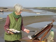
Categories
All
Archives
May 2018
|
 RSS Feed
