|
Every picture tells a story, they say, and whenever I pitch an easel out in the open, I invariably attract someone who wants to watch. Frequently they tell me about how their grandfather exhibited with the RI, and how they had a go once, but couldn't find The Muse. I normally reply that The Muse is very evasive and demands a certain amount of artistic blood to be squeezed from a stone before she deigns to appear! Sometimes I have an encounter that, though brief, stays with me forever. The first time I set up an easel at Wells-next-the-Sea was one such occasion. I had spent the morning pastelling in Staithe Street, and, my subject finished, I did some lightning studies of figures as they strolled by. Presently, an old lady appeared, shuffling up the street, pushing a battered shopping trolley. 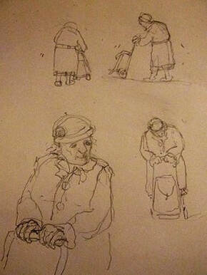 Pushing an old shopping trolley © Judith Key Pushing an old shopping trolley © Judith Key While the old lady was still some way off, I began to sketch her - not with any view of doing a likeness, just to try and capture the way she moved, and how she paused from time to time to catch her breath, before shuffling on a bit further. Her coat, which must have fitted perfectly once, was now too big, so that she seemed to have shrunken into it like a wizened walnut within its shell. Her shoes were like boats, and looked in danger of tripping her up. As she drew closer I stopped sketching and just held my breath and watched, ready to dart forward and lend a helping hand if needed. Finally, she drew level with me, and wished me a 'Good maarnin'.' We exchanged a few words, but between my struggling to latch onto her broad Norfolk, and she being somewhat deaf, we didn't get beyond a few amiable nods and smiles We made our farewells, and as she turned away, my ear was at last sufficiently attuned to catch her parting comment. 'Don' yew go takin' a picture of me, tha' lens might break!' And off she went, pushing her wonky trolley up the street, the squeaking of its wheels still audible after she had disappeared into the crowd. Although I visited Wells many times thereafter, I never met her again, but she made such an impression on me that she has lived on in many a painting of street and market place. 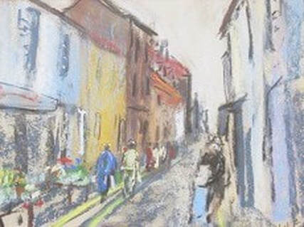 Staithe Street, Wells © Judith Key Staithe Street, Wells © Judith Key And here she is in this pastel of Staithe Street. This subject was worked on fine glass paper. With its multi-faceted texture it's good at bringing out the 'brights' in pastel. But its rough surface devours pastel sticks rapidly, and if you aren't careful it will also take the skin off your fingers! For that reason I very rarely use it, preferring papers such as Canson mi teintes or the softly flecked surface of Tiziano. 'Staithe Street, Wells' can be viewed in the Pastel Gallery under Landscape and Marine.
Markets can offer a complicated subject, what with the jumble of stalls, the variety of produce on display, traders touting for business, and people milling around, looking, buying, breaking off to catch up with friends, and moving on to mill some more. Aylsham market was no exception. My usual approach in busy situations is to keep it simple, focus on one stall with a few figures picking over produce, but don’t try and paint the whole scene, because there will be just too much happening. On this particular day, I broke my own rule… As always, I began by mooching around, finding a few angles and doing some thumbnail sketches, before settling down to my chosen subject, which on this occasion, was ‘all of it.’  Aylsham Market © Judith Key Busy as it was, I reduced everything down to three planes. I used the diagonal of the road to take the eye into the scene, leading the viewer from the foreground stall on the left, towards the busyness in the middle ground, and used the buildings and church in the background to add some visual weight. So the viewer goes on a journey, being pulled up the street, towards the central stall and on to the background buildings and the church tower, before falling back again to the central stall with its splashes of movement and colour. With such a busy subject, I didn’t want to complicate it further by using all the colours of the rainbow. I chose a restricted palette of two colours, Ultramarine and Burnt Sienna. These two colours are seen in their pure form on the central stall. The use of a near-black alongside them helps to ‘punch up’ their appearance. All the colours and tones, through the various browns and blue-greys to the near-black, were made from mixing the Ultramarine and Burnt Sienna together in different proportions.  Top Right: Burnt Sienna and Ultramarine, with the near-black created from mixing the two. Bottom Right: Burnt Sienna with Ultramarine added in increasing amounts, to create a range of warm and cool browns to blue-grey. True, I could have used a ready-made black, and there are a variety available, such as Paynes Grey, which is a cold blue-black, and Neutral Tint, which is a warm black. Then there are a number of earth colours available. I could have ended up with a dozen different tubes. By restricting myself to the Ultramarine and Burnt Sienna, I could vary the mix to make both warm and cool blacks and greys, as well as a range of earth colours. The ‘secret’ to fresh and lively-looking mixes is to introduce one colour into the other and not overwork the mix. If you stir them too thoroughly, the result can dry tired and flat.  Left: Ultramarine and Burnt Sienna allowed to mingle on the palette - showing the interplay of intermediate colours. The blue-grey mix is enlivened by the presence of the Burnt Sienna, and the browns are enlivened by the presence of the Ultramarine. I’ve often been asked about my approach to line and wash - do I draw first, then add the washes, or vice versa? I often do a little of both. What I always try to avoid is doing a drawing and then ‘colouring in’. In this case, I keyed in the bones of the subject with pencil, then blocked in with watercolour, and once this was dry, added the pen work. Then I added further shadows and finishing touches with watercolour. So there was a certain amount of interplay between pen and brush.
Over the years I’ve tried various pens, including dip pens with bottled ink, and a couple of home-made reed pens. My experience with the latter made me realise that my skill in making reed pens was severely wanting - not only did I cut the reeds badly but managed to slice my finger in the process. And like anything not very well made, my reed pens performed badly, too - so much so that I named them ‘Blobby’ and ‘Scratchy’, and after a few try-outs consigned them to the bin. I finally settled on Edding pens, available in various gauges and in both black and sepia, and this is the type of pen that was used for ‘Aylsham Market’. I enjoyed my morning doing pen and wash in Aylsham - until I got back to the car park and discovered I had a flat tyre. As I sourced a garage to come to the rescue, I reflected that it could have been worse. I will never forget the day, about 30 years previously, when I was driving home cross-country and had the misfortune to follow in the wake of a hedge cutter. The road was peppered with bits of hawthorn, which I thought I had negotiated successfully, until I was forced to pull up in the middle of nowhere with two flat tyres. But that is another story... 'Aylsham Market' was worked in pen and watercolour on quarter royal Fabriano ingres paper. I was on a trip to Norwich a little while ago, and with time on my hands I decided to explore Elm Hill in the heart of the old city. Partway up the cobbled street, I went down a little side alley towards the river. Turning back, I saw a subject that I knew at once I had to draw... 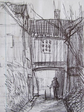 What caught my eye was that square of light and the figure in silhouette with a bicycle. The problem was I hadn’t come on a sketching foray, and was completely caught out without either sketchbook or pencil. Typical! - And by the time I’d sourced somewhere to buy them, that light would have gone. Fishing around in a pocket I found a biro and an old shopping list. Usually my old shopping lists have a new shopping list on the other side, but fortunately the reverse of this one was blank. With these very basic materials, I set to work… Right: Off Elm Hill, Norwich, by Judith Key I’m often asked how I approach a drawing, and the following sketches, done when I was back in the studio, show my working method. Once I’ve settled on a subject, I distil it down to a skeletal structure. This structure works in two ways:- 1) it makes an underlying design, which organises the picture space in a satisfying way. 2) it takes the viewer on a journey around the picture space towards the eye of the picture. 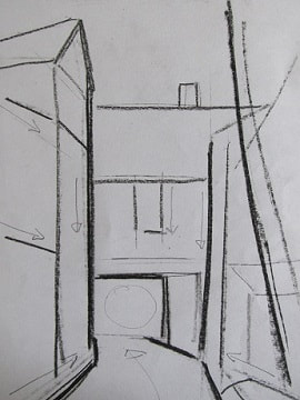 Here, everything is pared down to a simple skeleton of vertical, horizontal and diagonal lines and basic shapes. These combine to make both a satisfying design and to lead the viewer towards the compact square of light at the end of the passage. The alley way is a wedge shape, effectively an arrow, pointing us to the passage. This is further hemmed between two strong verticals, representing the buildings on either side. Lines of direction don’t have to be continuous - the shapes of the chimney and window not only echo each other, but follow a diagonal line down towards the passage, re-enforcing the design and counterbalancing the diagonal of the tree trunk on the right hand side. Sometimes I do two or three structural sketches like this on the spot, as there can be more than one answer to the visual journey. In the final drawing some of these structural lines will be re-enforced and some played down. It’s always a work in progress until I’ve finally set down my pencil - or biro! 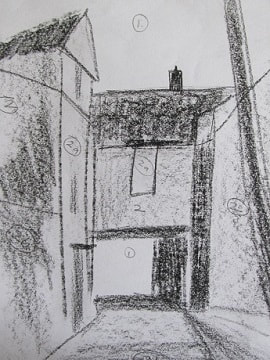 Next I look at tone. If you half close your eyes you get rid of colour and detail and see in blocks of light and dark. I start by cutting everything down to dark, light and middle tones. If I need more tonal values I find them either side of the middle. I generally find that five tones are plenty. When doing this I don’t look at each bit of the subject piecemeal, but see them as parts of the whole. I compare and contrast, grouping together each of the lights, darks and the middle tones, seeing them as blocks of related values. Look how the same dark is used for the rooftops, the vertical shadow on the right, and around the passage. They are all the same tone, but different and complementary shapes. Those darks around the passage now make the light stand out. This is why I spotted that light in the first place - because of the deep shadows that surround it. When you’re drawing buildings you need to stay true to the original, in order to say ‘it’s that building’, but you can change your viewpoint a little in order to make the shapes gel comfortably. Whatever jumps out as odd or disconcerting in the finished piece can often be traced back to the underlying design. This is why initial observation and groundwork are so important. 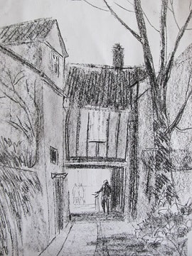 Finally, I build on the tonal structure, drawing in the subtler elements and the finer details. If you compare the final studio sketch with the original, you’ll see both similarities and differences. The studio piece is perhaps the more considered, but the one done on the spot has more life and sense of ‘being there’. This study was drawn in conté, a form of hard pastel, and the figures visible on the street beyond the passage were drawn in the lighter medium of a 2b pencil. The addition of these figures takes the viewer beyond the passage and out into the light, to continue the journey down Elm Hill... Left: Off Elm Hill by Judith Key If you want to have a go at drawing, you can learn a lot by spending time observing and distilling the subject down to skeletal structure and tonal blocks like this. It’s so easy to get bogged down in complicated surface details, and end up with a drawing where everything is vying with everything else, and the whole thing doesn’t gel. It can be a bit like writing a story where you get part way through and find you’ve lost control of who’s who, what’s what and where on earth has the plot rambled off to!
With practice, the eye will quickly strip away the clutter and be able to see the basic structure and key tonal values that underpin the subject. And when you’re out and about and spot a subject that you would absolutely love to draw, if only you had the right materials, well, dig in your pocket and fish out a biro and the back of the shopping list. You’ll find the right materials are the ones that you just happen to have to hand... Here we are in November, and looking back on the year we’ve had every kind of extreme weather, from enough snow to go into the igloo building business, through the Beast from the East, to the long summer drought that turned our gardens into near deserts. Recently there seems to have been no end of water. It has come vertically in stair rods, horizontally in the teeth of the wind, and in the case of a near neighbour, whose water meter went ‘pop’, it welled up out of the ground. With water so much in mind, I’ve chosen a suitable subject, ‘A Wet Day in Swaffham’. As usual when working outdoors in this sort of weather, the finger ends were too numb to wield the brush with much finesse, so draughtsmanship went out of the window in pursuit of the mood of the occasion - which was cold, wet, grey and miserable…  A Wet Day in Swaffham © Judith Key The subject was painted in watercolour with the addition of Chinese white, to create ‘body colour’. There are key differences between pure watercolour and body colour. Pure watercolour is transparent, will sink into and stain the paper, is very mobile in washes, and will react freely with adjacent colours. By contrast, body colour is opaque, tends to sit on top of the paper, and being mixed more thickly, is less mobile and reactive. The use of body colour enables me to work more quickly - a bonus on a damp day, when watercolour takes a long time to dry. When using pure watercolour I work from light to dark, as the light colours need to be laid over white paper to show to their full effect. When using body colour, I work from dark to light. The more white that is in the mix the thicker and more opaque it becomes, but the more readily it will lift off. So if I overlay it with swathes of dark or transparent washes, the body colour will lift away, sullying the whole lot. I would then end up depicting an even greyer, more miserable day, that it actually was… As an old market town, Swaffham has many potential subjects to attract the artist’s eye. It is noted as the birthplace of Howard Carter, who, with Lord Carnaervon, discovered Tutankhamun’s tomb. The town hall houses a small museum dedicated to Carter’s life and work, where a number of his own archaeological drawings and watercolours are on display. I shall certainly be paying another visit with my paints before long - hopefully on a brighter, drier morning! 'A Wet Day in Swaffham' was painted on 1/8 imperial canson mi teintes paper. I recently received an enquiry about the location for the print of Friday Market, Walsingham. Walsingham is a busy pilgrimage village, chock full of shrines, mediaeval ruins and quaint half timbered Tudor buildings. There’s lots to paint, but setting up an easel can be challenging amid the crowds and traffic, so this subject was painted outside of the main pilgrim season when things were a lot quieter and I could work undisturbed.  Friday Market Walsingham © Judith Key I stood at the lower end of the High Street, on an area of cobbled pavement - if you’re planning to visit Walsingham, do wear ‘sensible shoes’ as these cobbles do not take kindly to heels! The building to the right is known as the ‘cheese wedge’, its shape being defined by the fact that it is sandwiched between the road which leads to the Friday Market, visible in the background, and the High Street, which is out of the frame. If you’re wondering whether I ever go there to paint the market stalls, the answer is no, because the only aspect of the market that has survived into the modern age is the name of the square itself. ~ We’ve all experienced cloudbursts over the past week or so, and the following sketches were done further up the High Street, on a day when I was caught out by the weather.  This first linear sketch was done sheltering in a shop doorway. I was working with 2b pencil on A5 copier paper, my default sketching paper for working outdoors, as it's so cheap it doesn't matter if it gets wet. The rain had come suddenly and I was attracted by the fact that all the umbrellas were up and everyone was dashing for cover. It was sheeting down and in no time the road was all puddles. And how exotic a puddle can be when you haven't seen one all summer! I thought I would just get down a quick impression, and dash back to the car, but the rain eased for a few moments, so I was tempted to do another study, this time in tone. Most of the passers-by had sought shelter indoors, so I used some of the figures from my first sketch, to add a bit of life and scale to the subject. This second piece was drawn in conté, a hard pastel with which I’m able to shade a large area rapidly. The sky was still looking ominous, and there was another downpour while I stood there, so again I needed to focus on the impression rather than getting bogged down in detail. I did want to pick out the little village pump, which is just off centre in the background, so used strong tone, throwing back the buildings behind with a lighter touch.  The large building to the right with the archway is the main entrance to the Abbey. Dissolved by Henry VIII, all that remains of the original building is the impressive East Window, but the Abbey grounds with their woodland walk and winding stream are also well worth a visit at snowdrop time. To the right of the archway is the wall of the only grade1 listed public lavatories in England. Again, well worth the visit, should you feel the need… The print of Friday Market, Walsingham is available for the sum of £20 + postage and packing. It can also be purchased wherever I give talks and painting demonstrations. Further details can be found on the Prints page; please use the Contact page to enquire or place an order.
It's the height of summer, the gardens are in full bloom, but if you still have a space in the border, or have a flower vase you want to fill, a trip to Fakenham market on a Thursday morning will find several stalls dedicated to plants and flowers.  Flower Stall, Fakenham © Judith Key This watercolour was painted on Saunders Waterford quarter imperial 'not' paper. I was drawn to the subject by the hazy quality of the light and the way the display of flowers seemed to tumble and flow almost like a waterfall, from the table down to the pavement. Once upon a time Fakenham had a thriving cattle market and printing industry. But in the 1960s both railway stations closed, the cattle and the print works disappeared, and Fakenham became a sleepy backwater, bypassed by the rest of the world. But on Thursdays, Fakenham comes alive once more - the centre of town is choc-a-bloc with bright canopied stalls, selling everything from cheese, fish and vegetables to baskets, bric-a-brac and ironmongery. The tea wagon starts brewing, the smell of hot dogs fills the air, and tables fill up with people eating al fresco. On one street corner or another, buskers, displaying their talents on guitars, violins or accordions, attract a small, passing audience and welcome the tossing of coins into a hat.  Occasionally, amid the crowd, an artist might be seen, beavering away, with sketchbook in hand. As people pass by there's no time for detailed study. I stand for some time, observing the scene, and among the crowds there will be certain characters that stand out. The three sketches that illustrate this month's blog show the universal appeal of taking home an attractive bouquet... Unlike the buskers, I don't seek an audience when I'm out on site. But the only problem with working in busy places is that I'm more likely to attract attention. Much as I try to hide away in a quiet corner, people still manage to seek me out and look over my shoulder as I work.  I don't mind, as long as they don't break my concentration by trying to engage me in conversation. When I'm painting I find that the frequent splat of a paintbrush tends to make them step back and give me a bit of space. But when all I have is a sketchbook, my favoured piece of ammunition is missing... I can hardly poke them with the sharp end of a pencil if they get too close, so I tend to respond with an occasional distracted grunt, as they tell me how their grandfather exhibited at the Royal Academy, and how they had a go once, but couldn't draw a straight line. There is usually a pause, as they watch me work, during which I somehow manage to show that I can't draw a straight line either. They then step away, saying, 'It's a gift, isn't it?' Occasionally this remark is delivered in such a way as to imply that not only do they lack such a gift, but evidently so do I...  ~ The one time I do welcome an audience is when I give painting demos and talks. On such occasions, you are guaranteed not to be treated to a string of inattentive grunts or splatted with paint water. But amid the selection of greetings cards for sale, you will find that I have taken a tip from the buskers, and there will be a strategically placed upturned hat for receipt of coins! ~  Pushing an old shopping trolley © Judith Key Pushing an old shopping trolley © Judith Key Every picture tells a story, they say, and whenever I pitch an easel out in the open I invariably attract someone who wants to watch. Frequently, they tell me about how their grandfather exhibited with the RI, and how they had a go once, but couldn't find The Muse. I normally reply that The Muse is very evasive and demands a certain amount of artistic blood to be squeezed from stone before she deigns to appear! Sometimes I have an encounter that, though brief, stays with me forever. The first time I set up an easel at Wells-next-the-Sea was one such occasion. I had spent the morning pastelling in Staithe Street and, my subject finished, I did some lightning studies of figures as they strolled by. Presently, an old lady appeared, shuffling up the street, pushing a battered shopping trolley. I have an affection for shopping trolleys, as I have owned a succession of them. I've never actually used one for shopping, but for carrying my easel, painting boards and other gear, because the spot where the Muse has decided to sit and wait for me is often, inconveniently, half a mile from the car. While the old lady was still some way off, I began to sketch her - not with any view of doing a likeness, just to try and capture the way she moved, and how she paused from time to time to catch her breath, before shuffling on a bit further. Her coat, which must have fitted perfectly once, was now too big, so that she seemed to have shrunken into it like a wizened walnut within its shell. Her shoes were like boats, and looked in danger of tripping her up. As she drew closer, I stopped sketching and just held my breath, ready to dart forward and lend a helping hand if needed. Finally, she drew level with me and wished me a 'Good maarnin'.' We exchanged a few words, but between my struggling to latch onto her broad Norfolk, and she being somewhat deaf, we didn't get beyond a few amiable nods and smiles. We made our farewells and, my work finished, I took a couple of photos up and down the street as reference for later use in the studio. As the old lady turned away, my ear was at last sufficiently attuned to catch her parting comment. 'Don' yew go takin' a picture of me, tha' lens might break!' And off she went, pushing her wonky trolley up the street, the squeaking of its wheels still audible after she had disappeared into the crowd. Although I visited Wells many times thereafter, I never met her again, but she made such an impression on me that she has lived on in many a painting of street and market place.  Staithe Street Wells © Judith Key Staithe Street Wells © Judith Key And here she is in this pastel of Staithe Street. This subject was worked on fine glass paper. With its multi-faceted texture it's good at bringing out the 'brights' in pastel. But its rough surface devours pastel sticks rapidly, and if you aren't careful it will also take the skin off your fingers! For that reason I very rarely use it, preferring papers such as Canson mi teintes or the softly flecked surface of Tiziano. 'Staithe Street, Wells' can be viewed in the Pastel Gallery under Landscape and Marine. |
Judith Key
Judith Key is a Norfolk based artist, working in watercolour and pastel. She has exhibited with the Society of Graphic Fine Artists and New English Art Club at the Mall Galleries, London. Her paintings are in collections worldwide. 
Categories
All
Archives
May 2018
|
 RSS Feed
